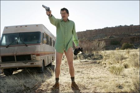
sie sind in aller munde. ich schreib nix drüber.
WICKED WICKED WICKED!
top content aus den comments, der muss auf die frontpage:
thnks to sr.
lyrics:
Check it out…
Your site design, the first thing people see. It should be reflective of you and the industry. Easy to look at, with a nice navigation When they can't find what they wan it causes frustration A click costs an action. To increase the temptation Use appealing graphics that create motivation You have animation please use in moderation ‘Cos search engines can't index the information
Display the logo of all associations Highlight your content; therefore that’s an obligation. Create clean design; you can use some decoration But try to prevent any client hesitation Every page that they click should provide an explanation Should be easy to understand like having a conversation Create a site style you can use your imagination But make sure you use correct colour combinations Do some investigation, looks at other organisations But don’t duplicate or you might face a litigation You done? Congratulations start construction
Move into production, please follow these instructions: Your photoshop functions, slice that design Do you layout with divs make sure there is a line Please don’t use tables even though they work fine When it come to indexing they give searchers a hard time Make it easy for spiders to crawl what you provide Removed font type, font colour and font size No background colours, keep your coding real neat And tag your look n feel on a separate style sheet Better results with XMl and CSS, Now you making progress, a ‘lil closer to success Describe you doc type so the browser can relate Make sure you do it great or it won’t validate
Check in all browsers, I do it directly Gotta make sure that it renders correctly Some use IE some others use flock Some use AOL, I use Firefox Title everything including links and images Don’t use italics, use emphasis Don’t use bold please use strong Cos if u use bold that’s old and wrong
You use CSS your page should load quicker Your client's satisfied like they easting on a Snicker They stuck on ur page like u made it with a stickers And then they convert now that the real kicker
Make u a lil richer, your site a lil slicker Design and code right man I hope u get the picture What I'm telling you is true man it should be a scripture If it's built right you’ll be the pick of the litter Everyone will wanna follow you like twitter
Competition will get bitter You will shine like glitter If u tryna grow; your company will get bigger Design and code right man can you get with it?
Design & Coding…
-
Gmail keyboard shortcuts
was geschied geschied nicht bevor es geschied
a n g e r
no more excuses:
Run to Your Grave from the mae shi on Vimeo.
-
great name, great app
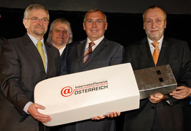
Wien, 03.03.2008 - Bundeskanzler Schüssel Gusenbauer und Vizebauer Willi Molterer geben den Start der Internetoffensive Österreich (sic!) bekannt.
 Als Dank wird Ihnen von der Vereinigung der Internet Service Provider Österreichs eine Kopie des gesamten österreichischen Internets auf einem USB-Stick überreicht.
boom dadadadadadada boom dadadada boom dadadadadadada boom dadadada
global warming is over. now start to fear global cooling.

